Visual Identity & Brand Guide for People of Hope
Catholic Charities, USA | JULY 2025
People of Hope is a national storytelling initiative from Catholic Charities USA that highlights the everyday impact of Christian service. Rooted in more than a century of compassion and action, the project gathers and shares testimonies from Catholic Charities agencies across the country—personal stories that humanize crises and reveal Christ’s love at work in communities.
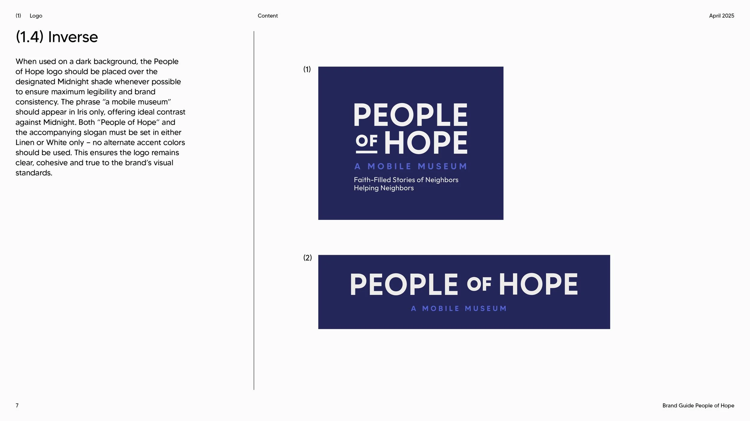
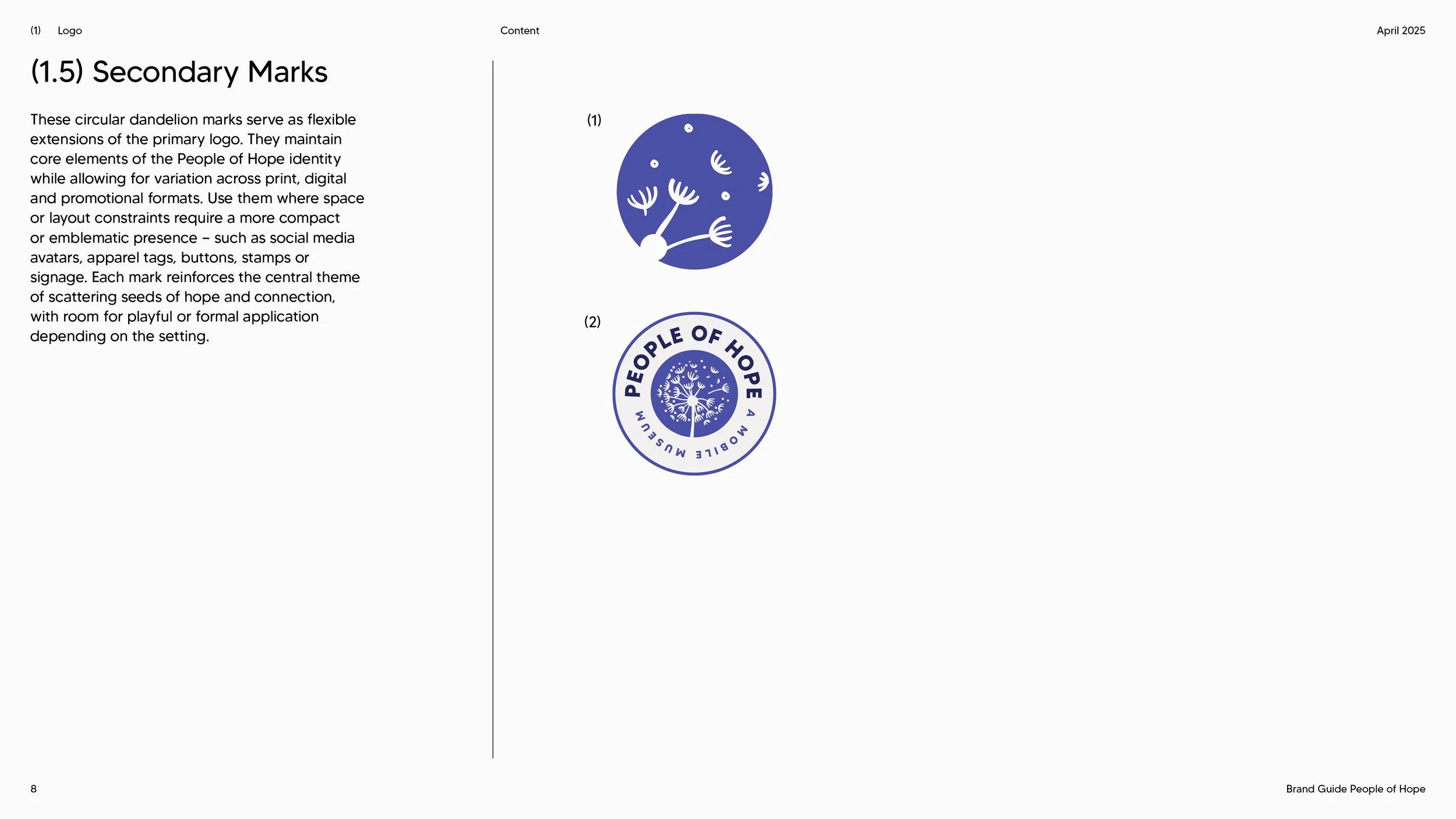
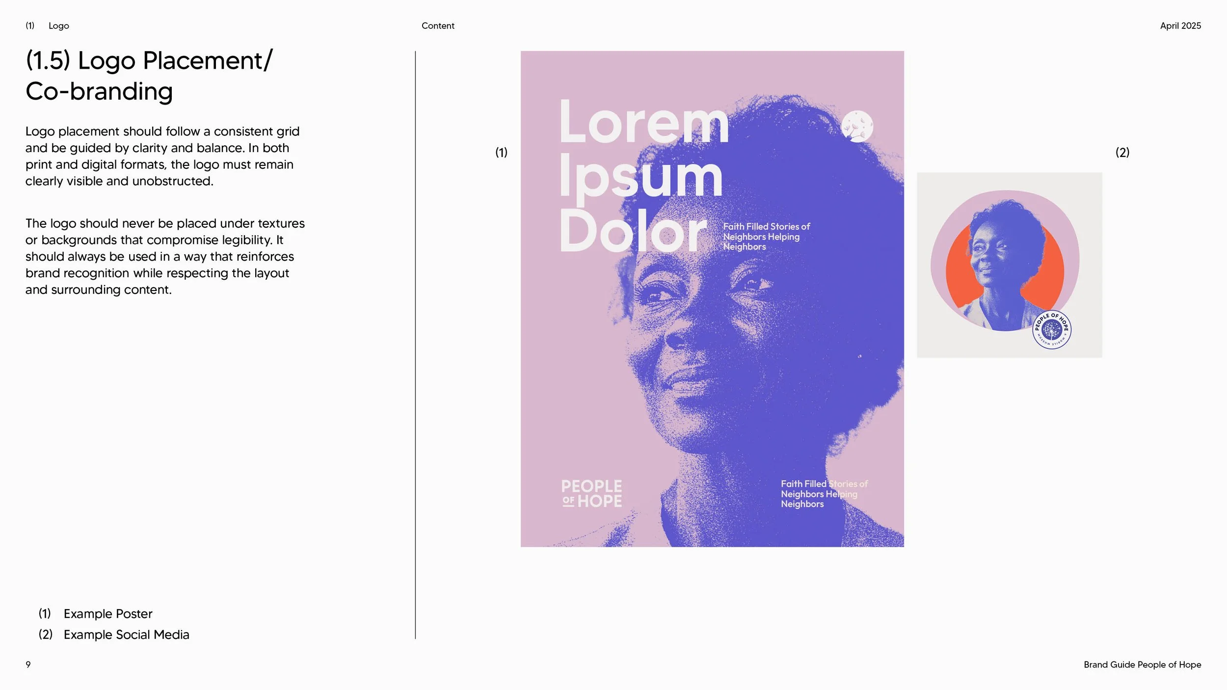
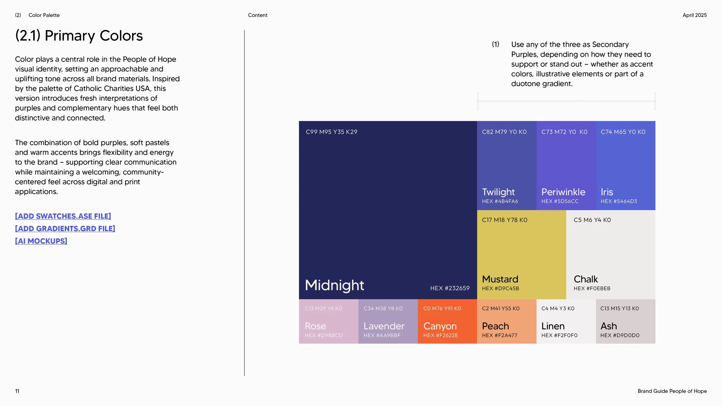
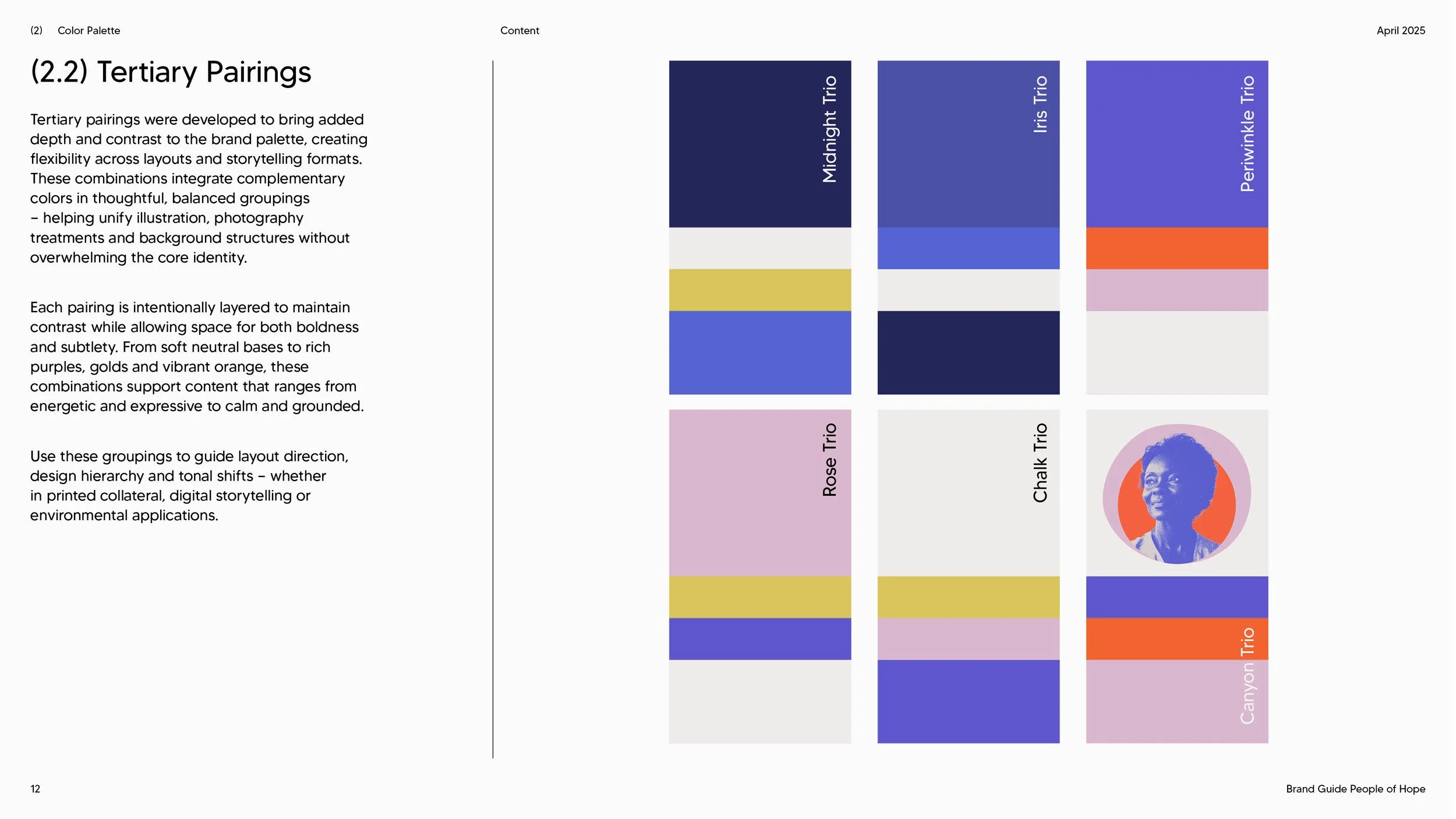
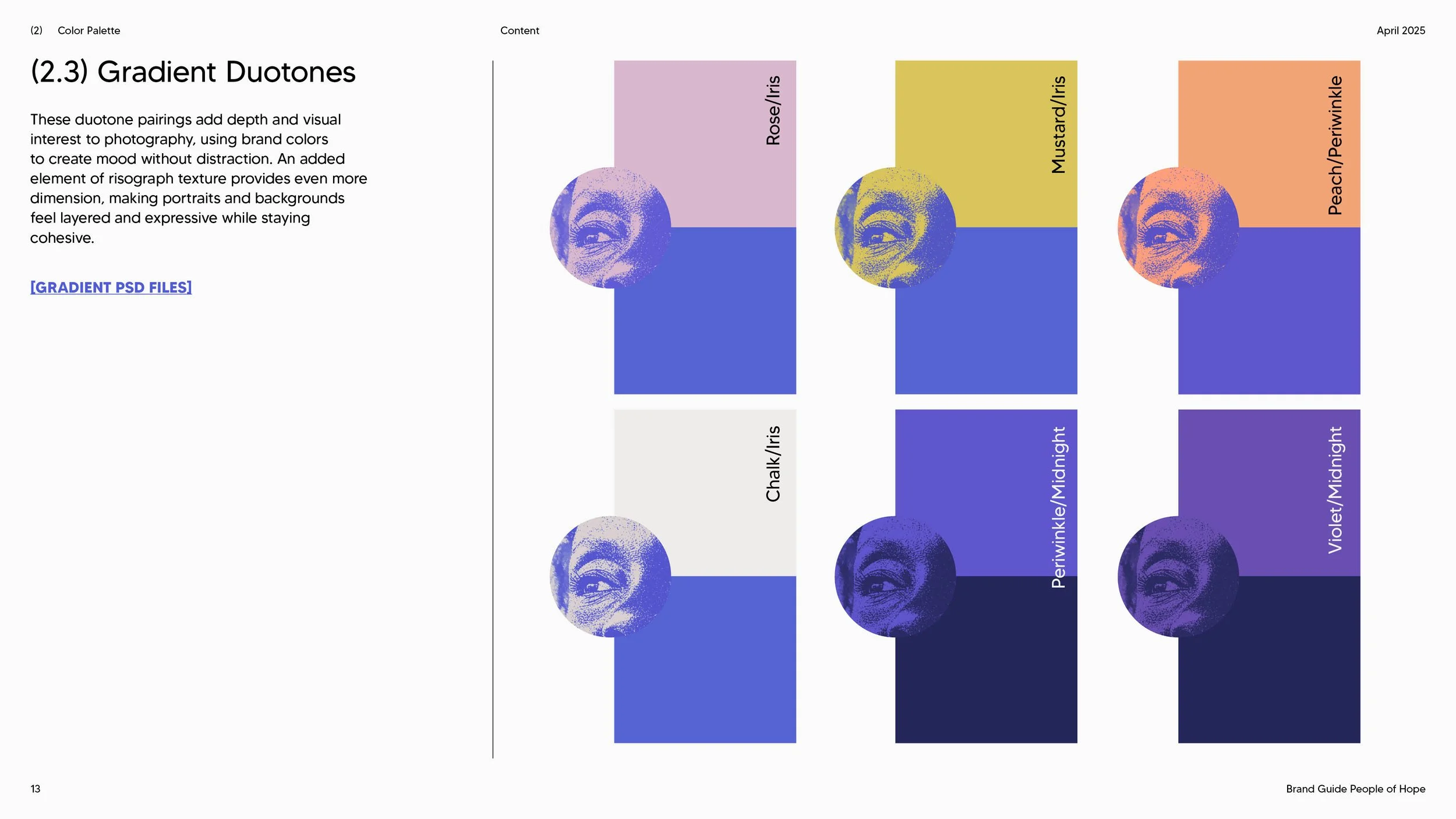
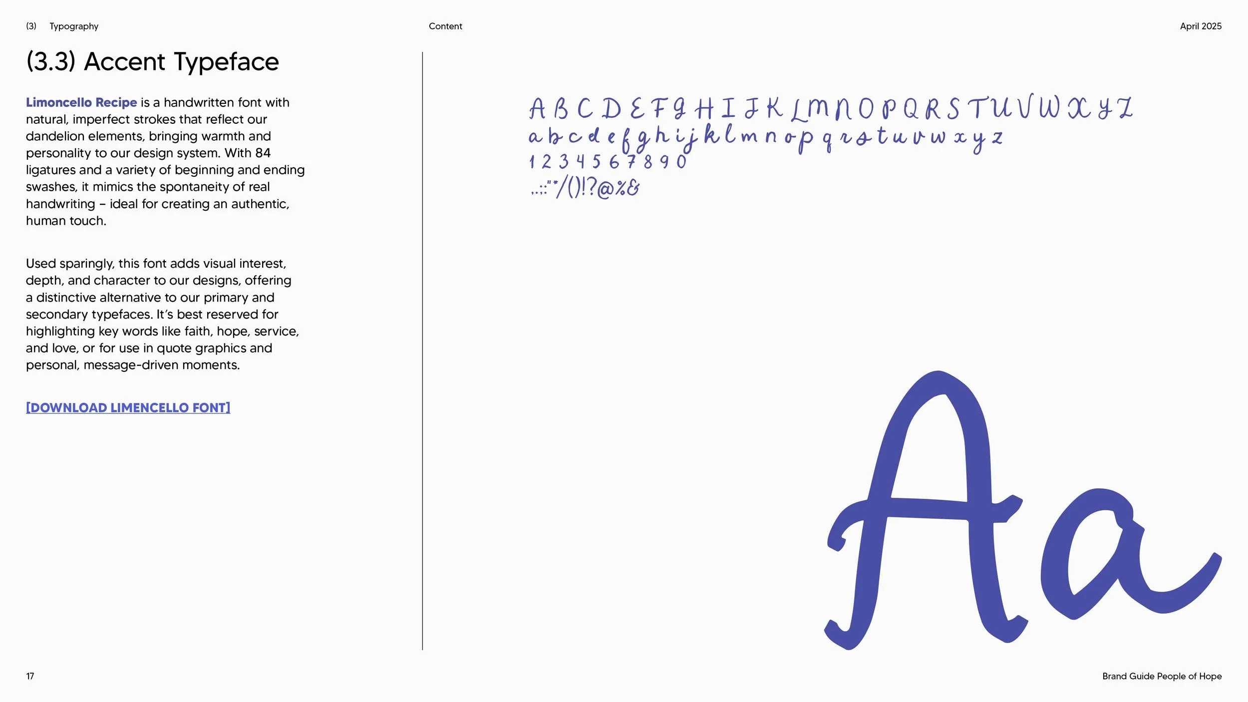
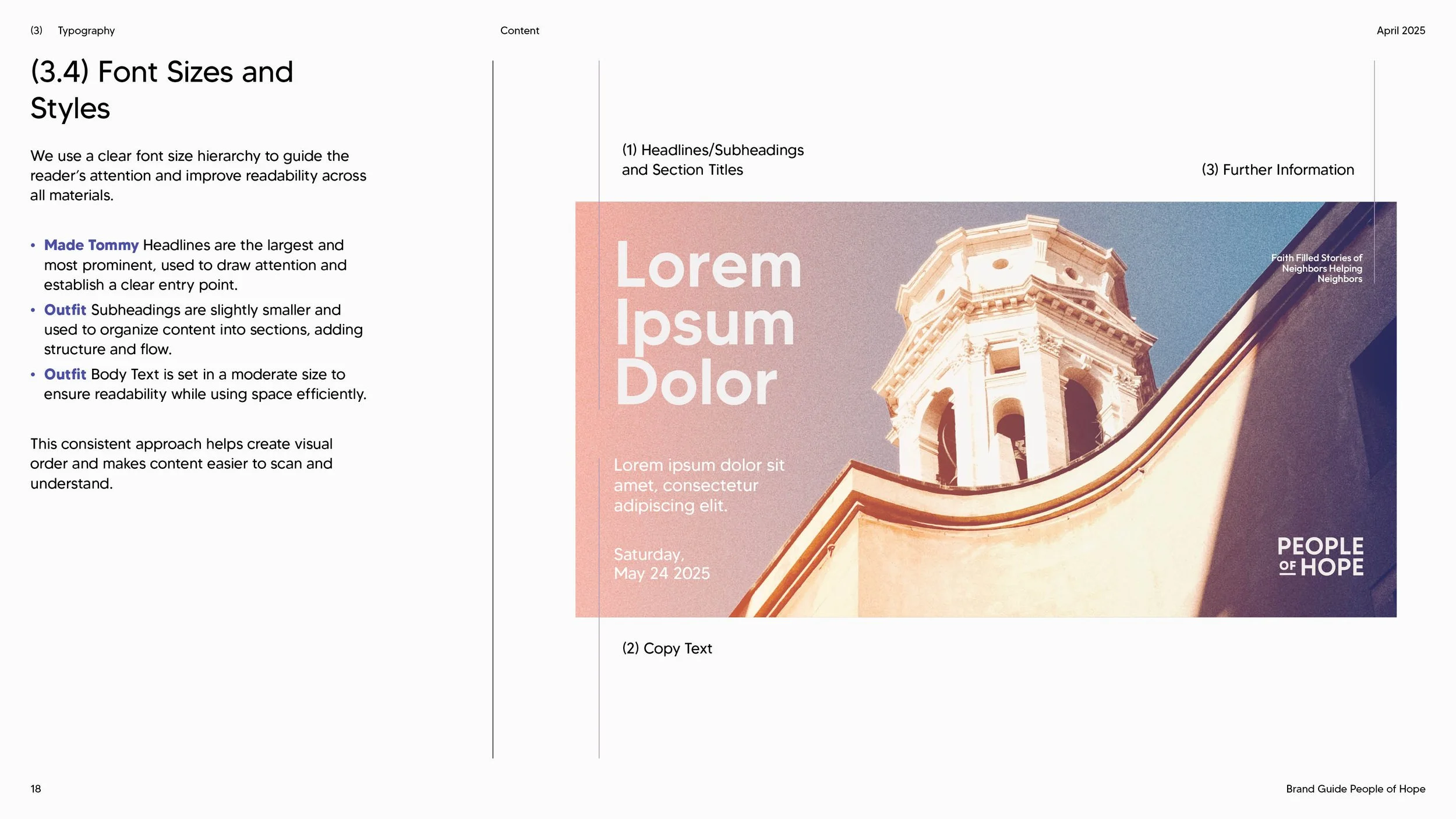
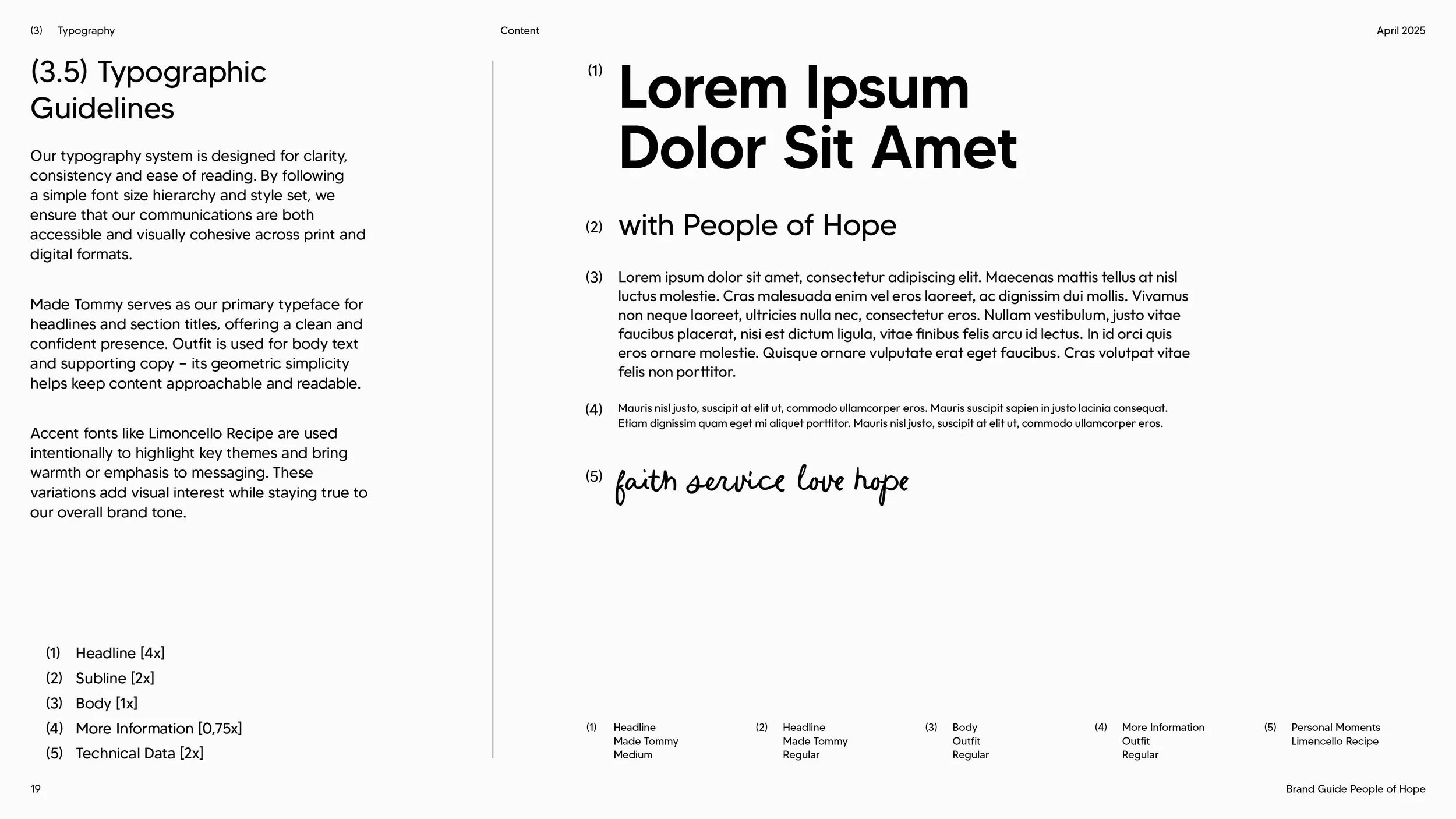
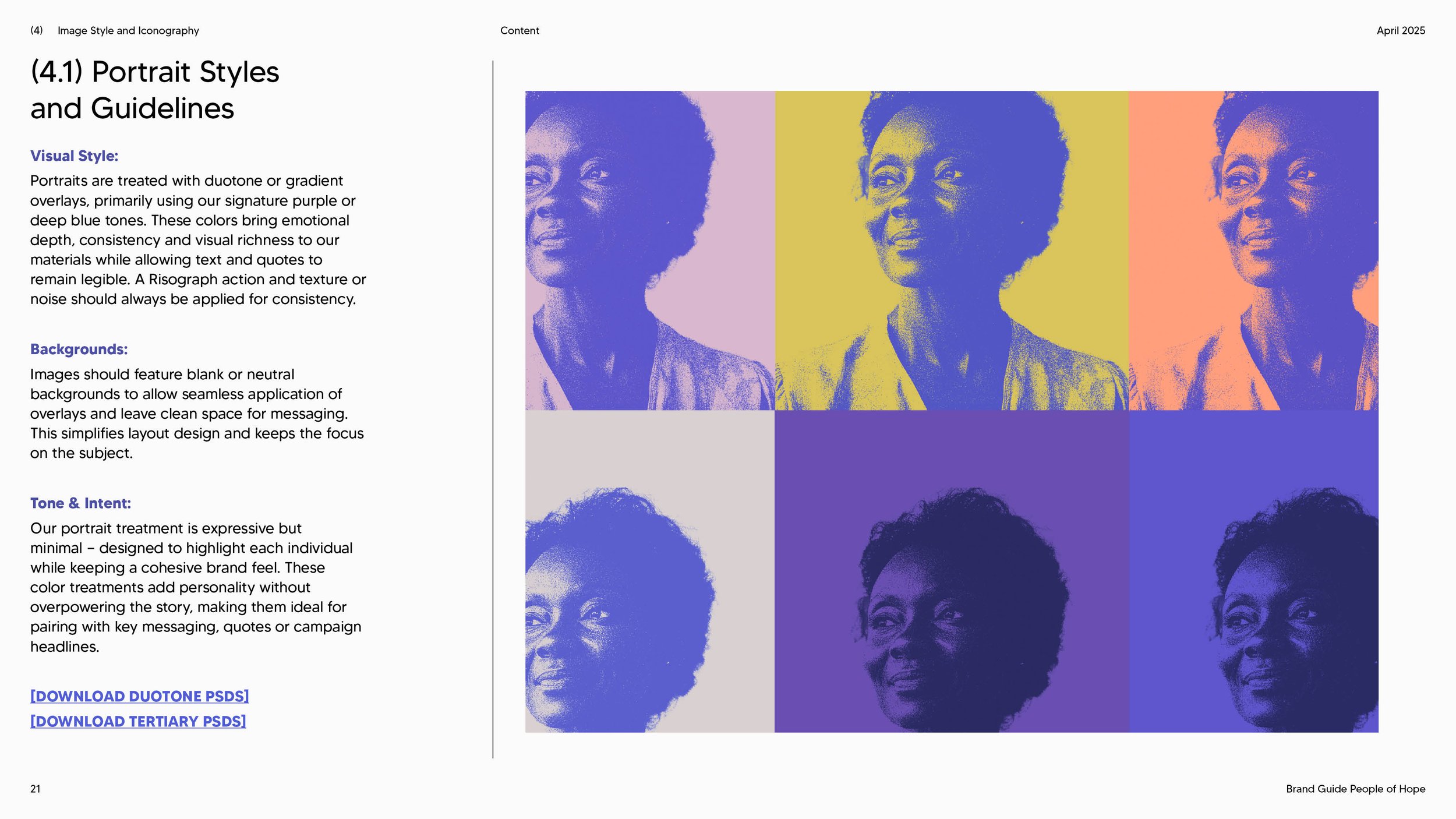
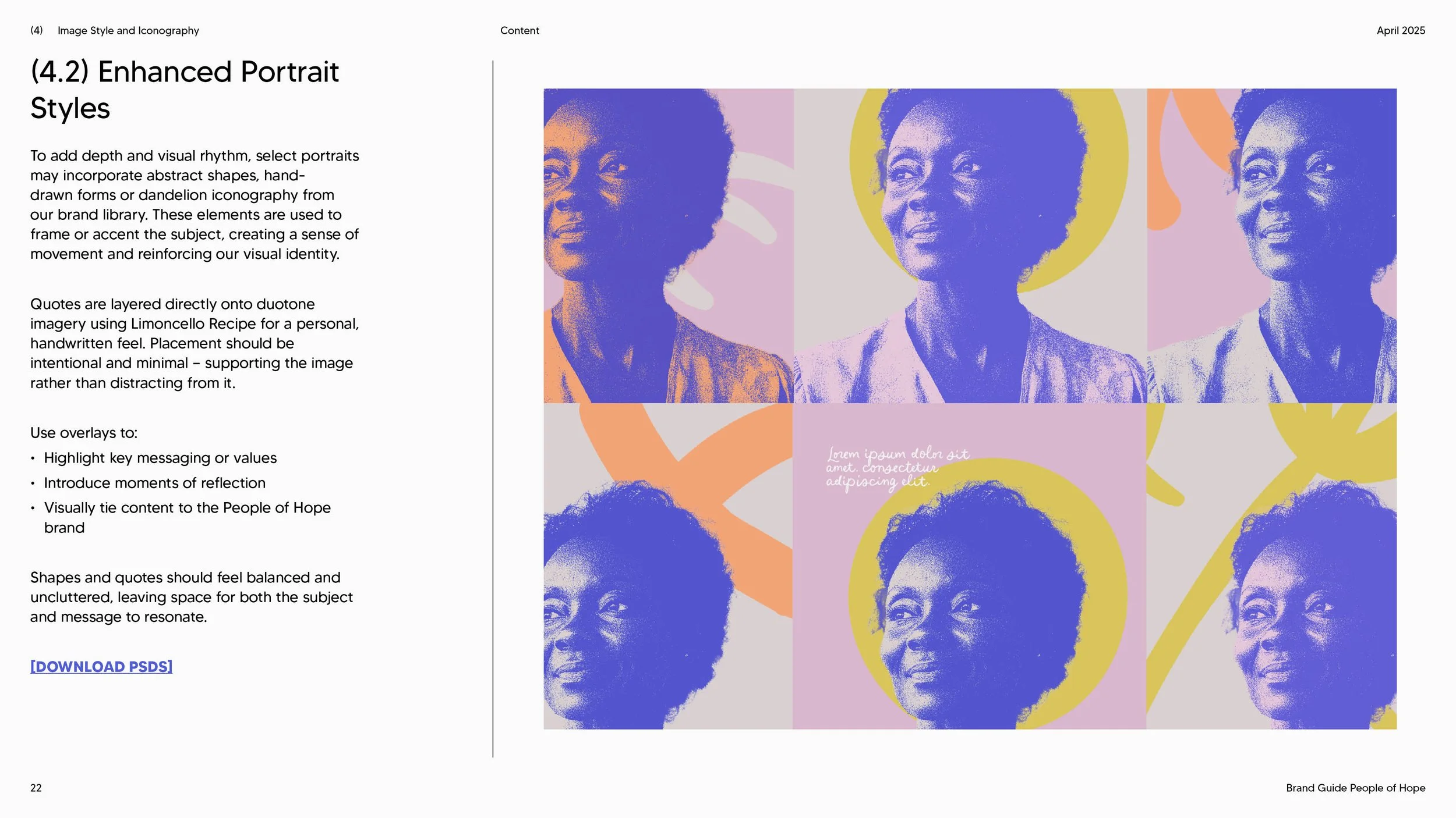
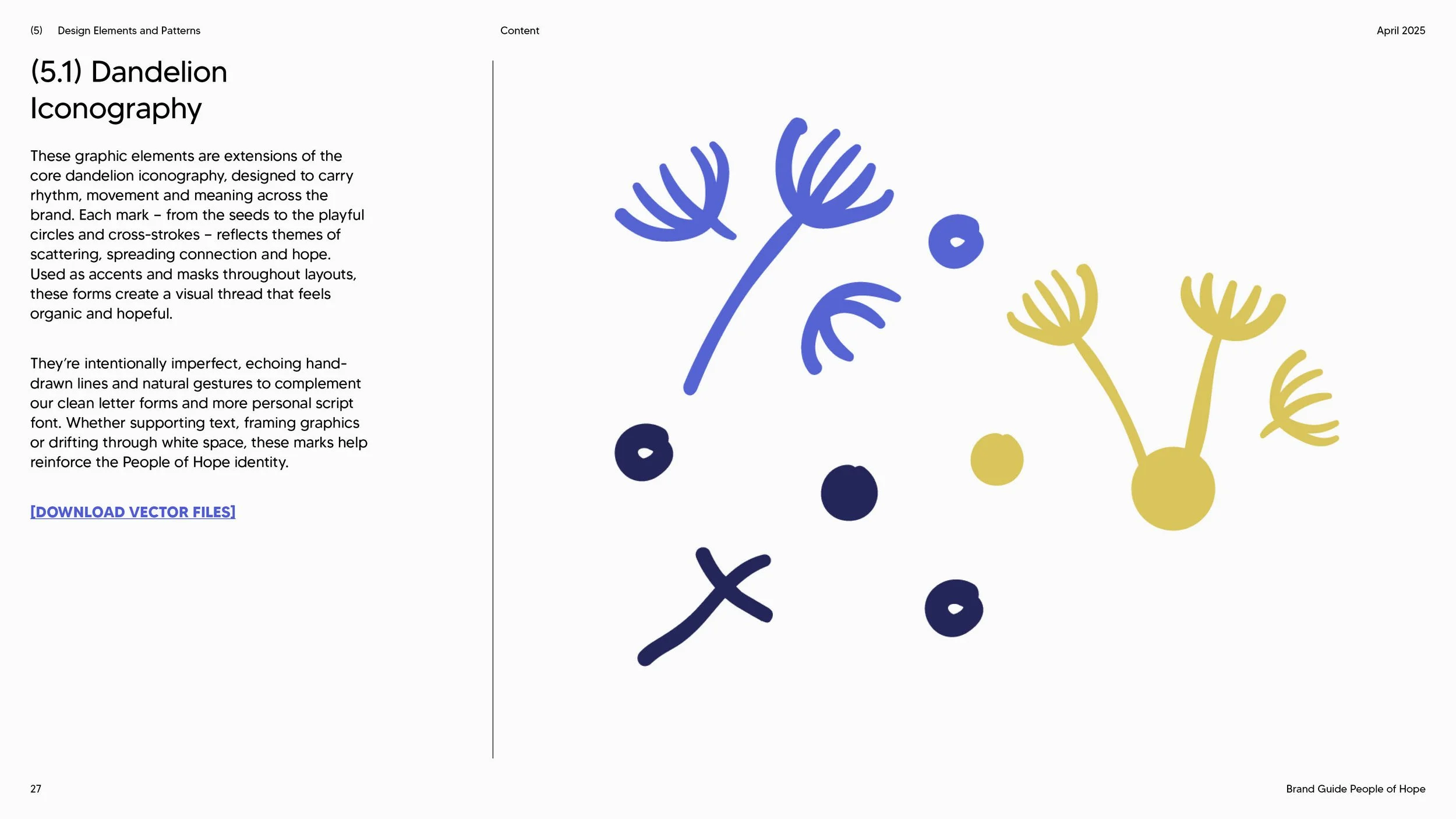
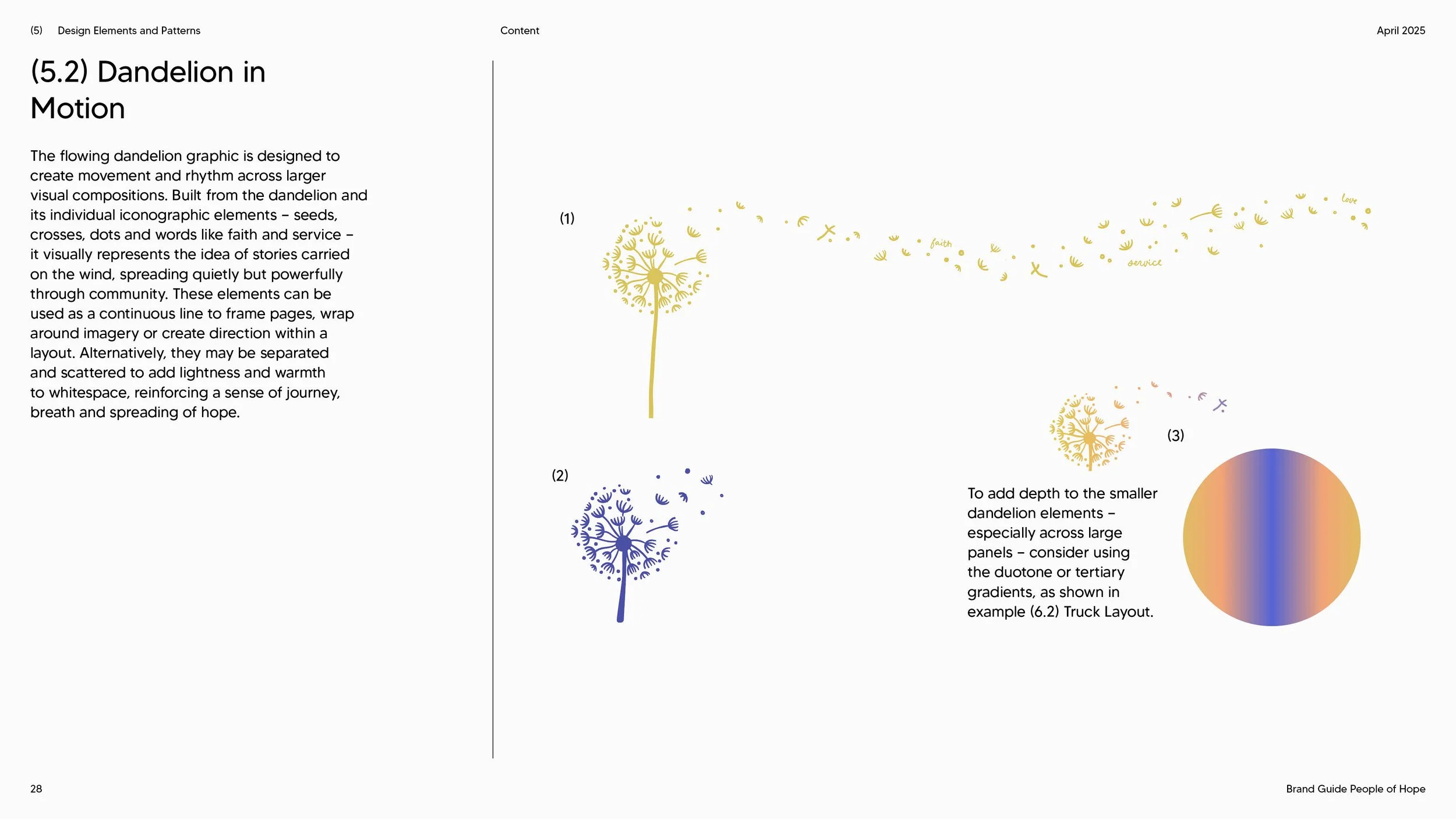
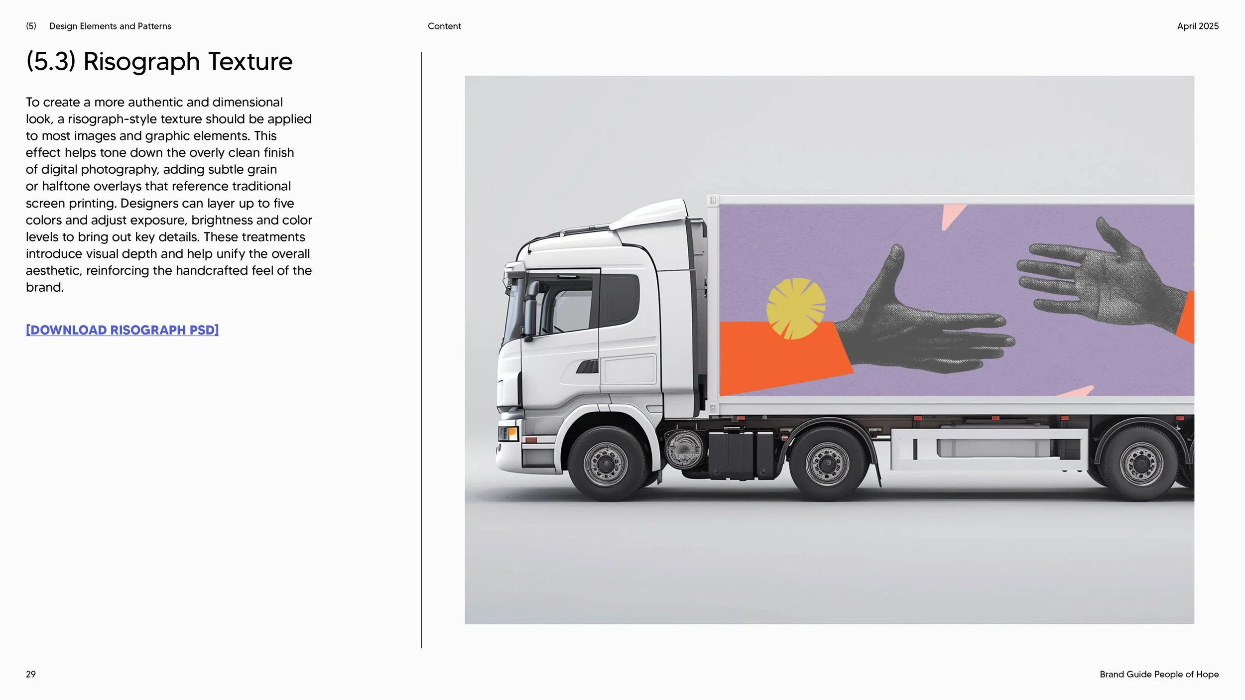
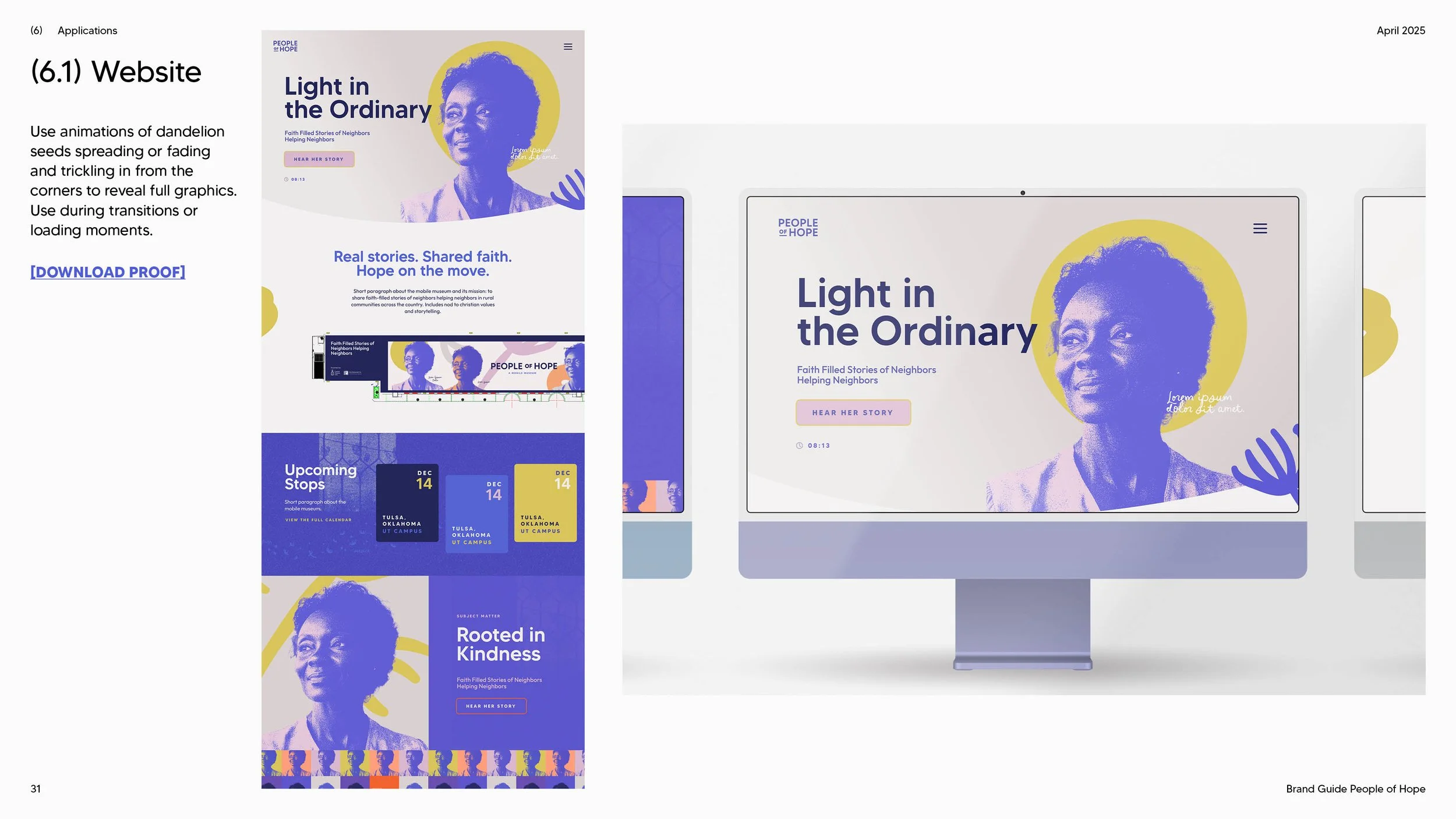
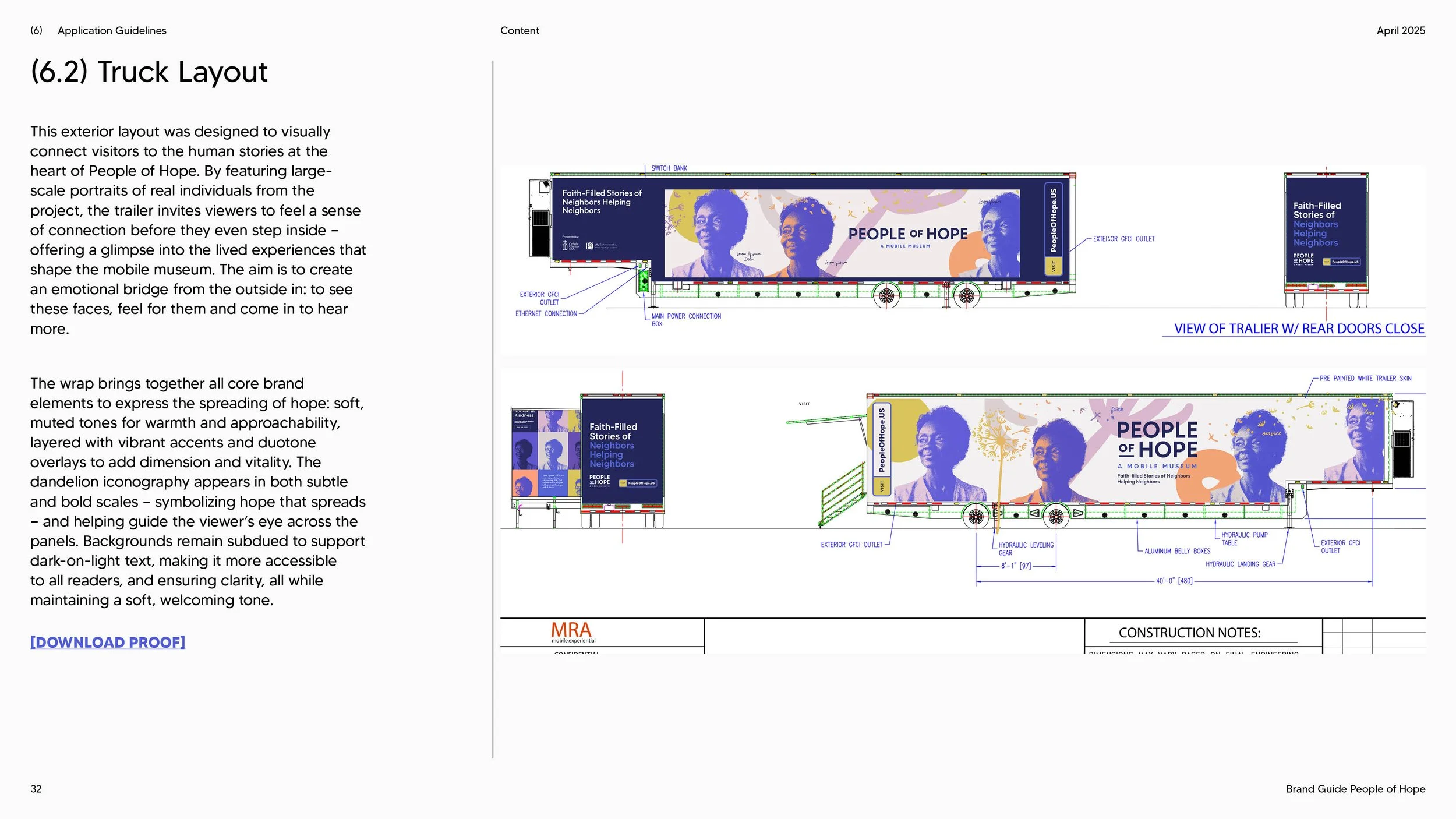
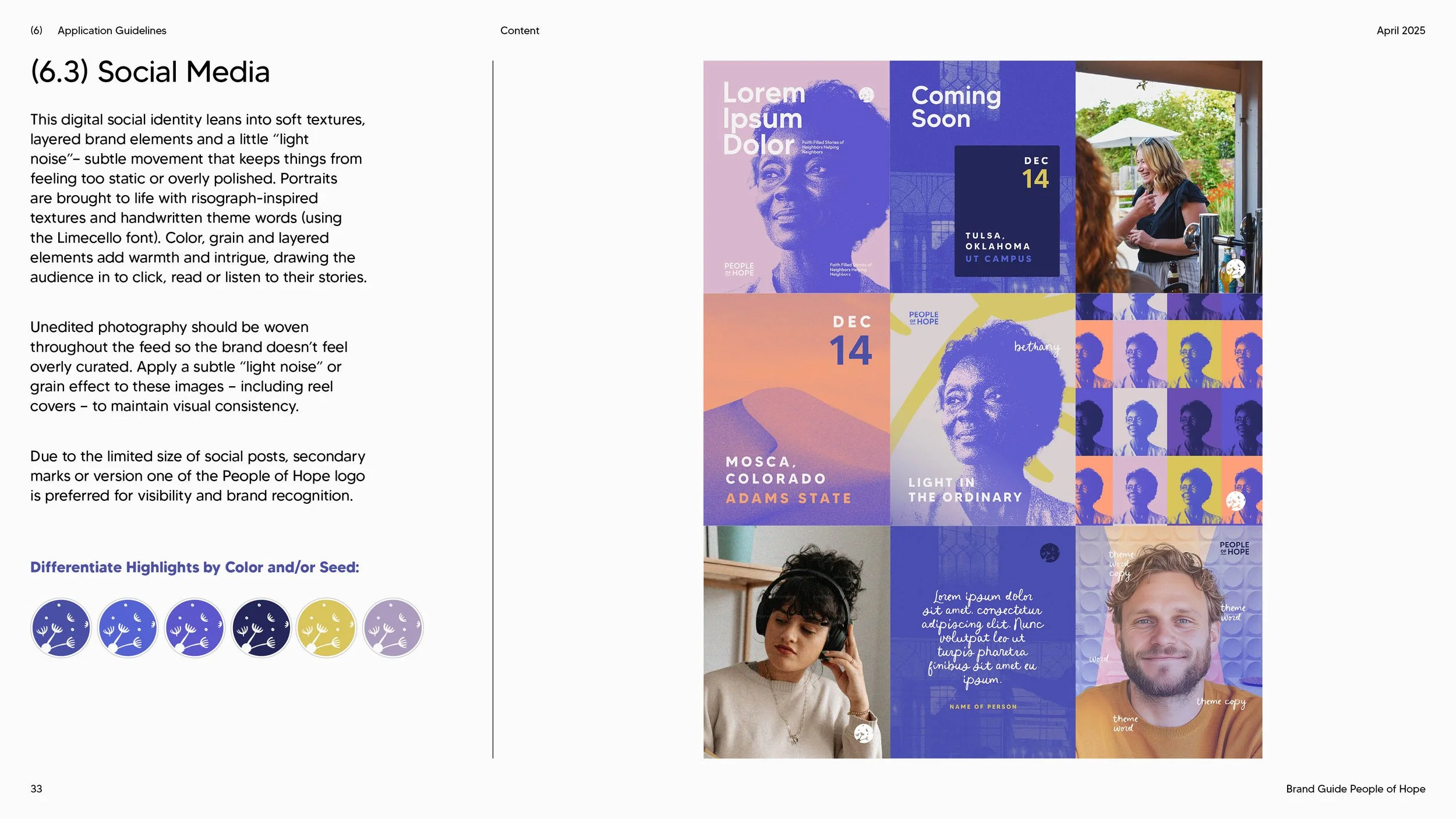
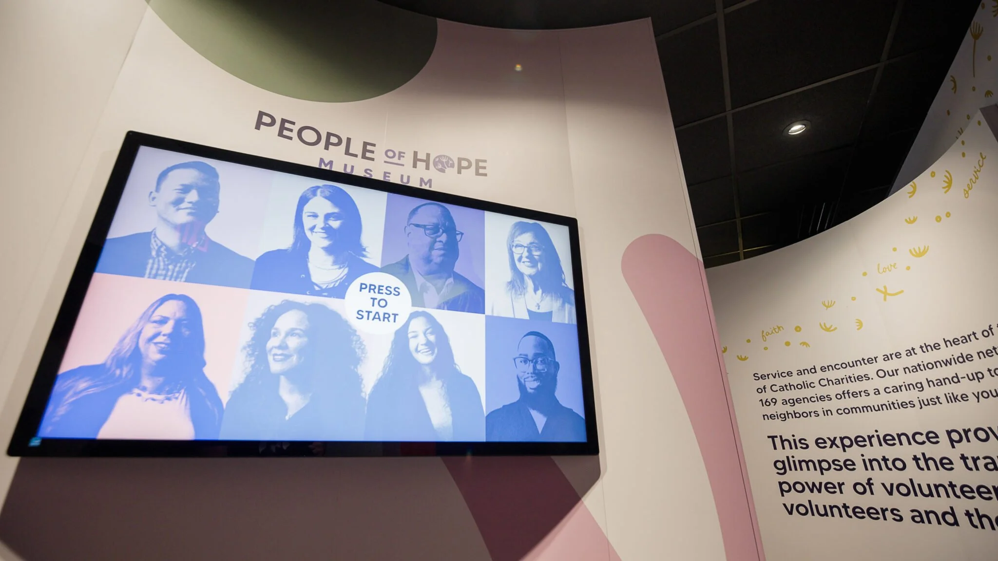
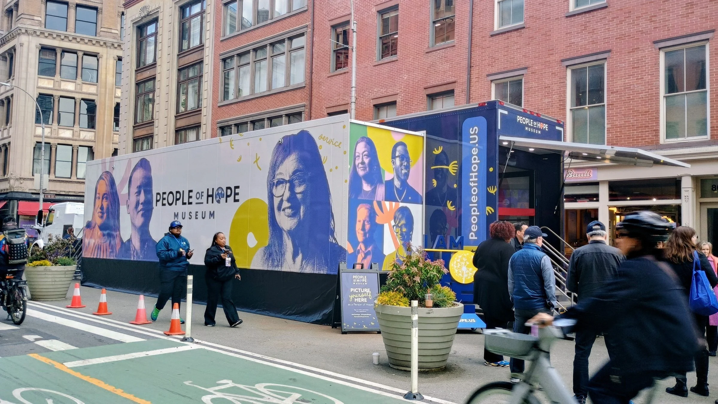
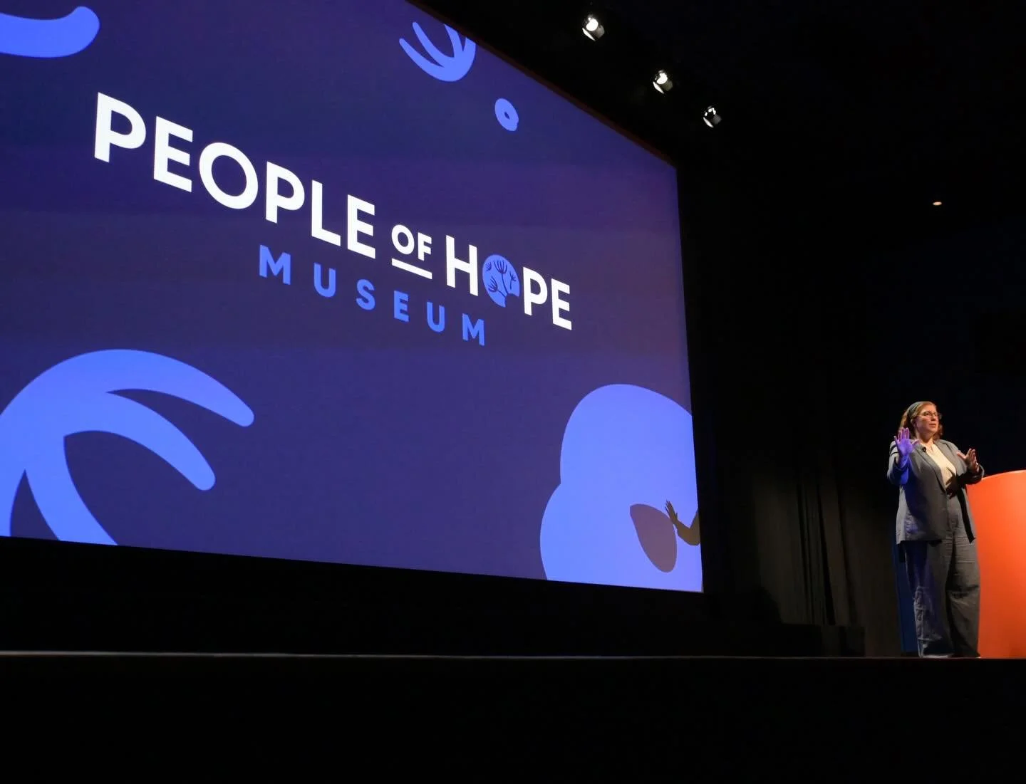
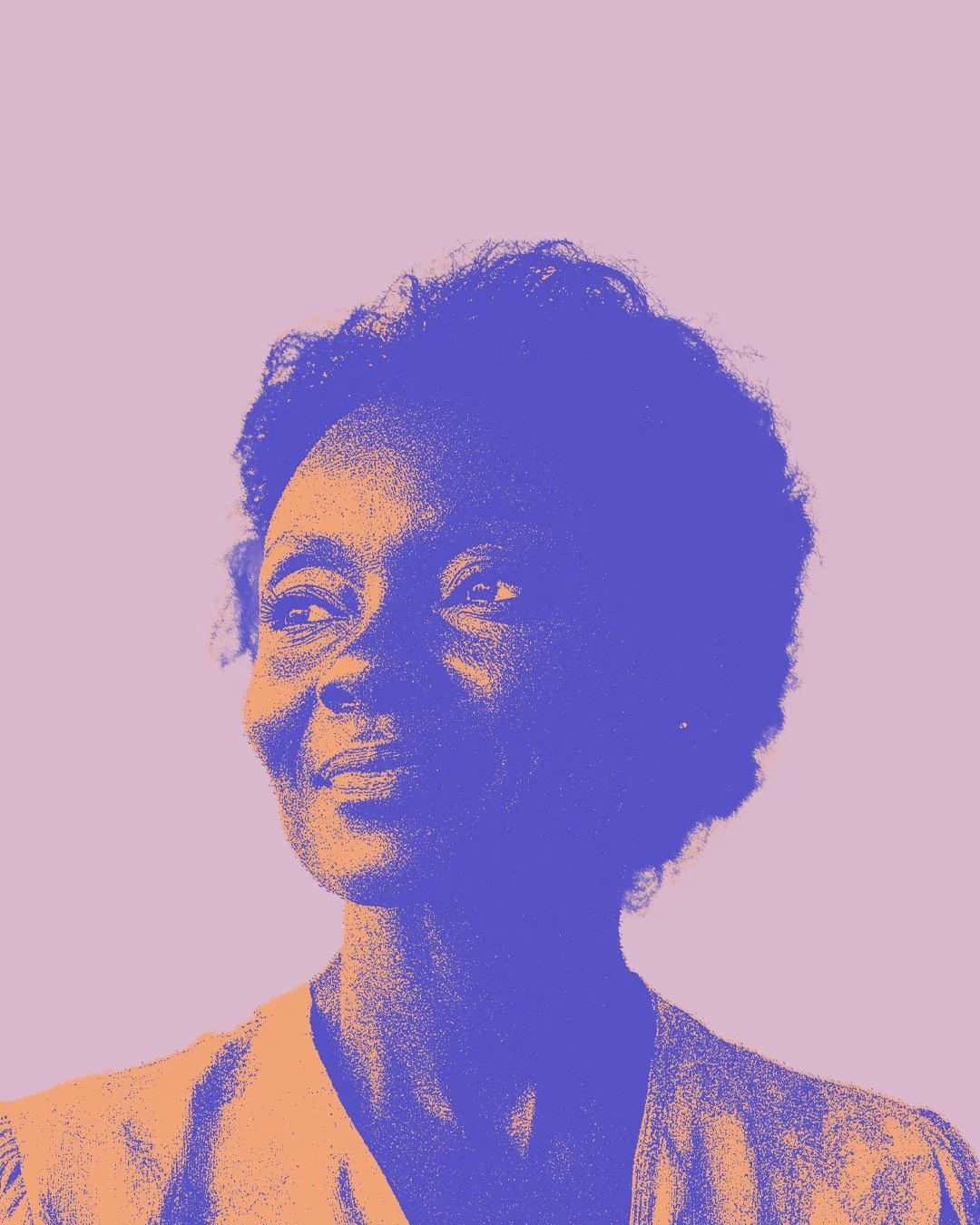
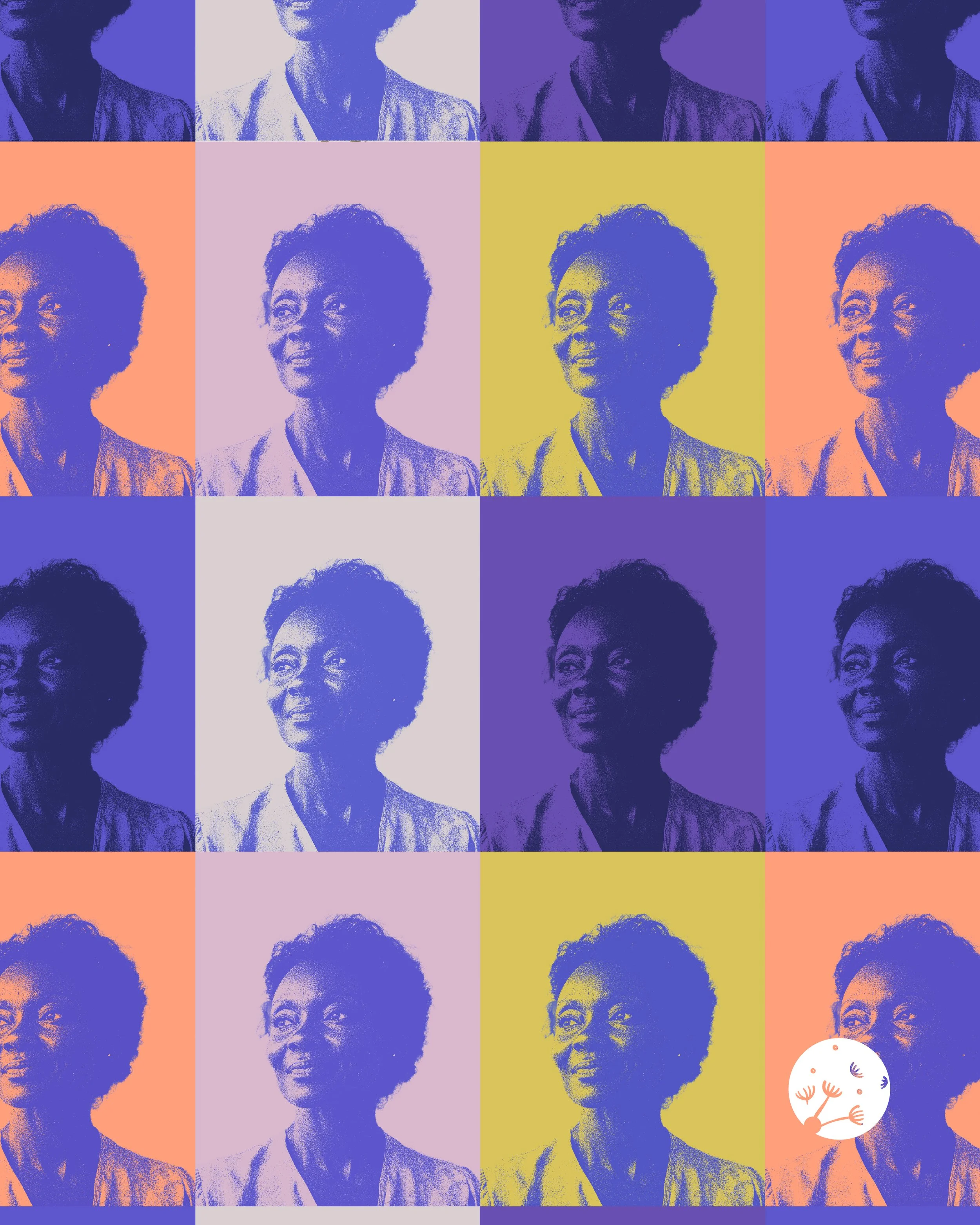
The visual identity I developed for People of Hope combines bold purples, soft pastels, and warm accents to bring both flexibility and energy to the brand. Portraits are layered with duotone or gradient overlays—most often in our signature purple or deep blue—adding emotional depth, consistency, and visual richness to every story. To introduce rhythm and movement, select images incorporate abstract shapes, hand-drawn forms, and dandelion-inspired motifs drawn from the brand library. The dandelion serves as the heart of the identity: each seed, playful circle, and cross-stroke symbolizes scattering, connection, and the spread of hope. Together, these elements create a cohesive system—applied across the logo, typography, website, and even a full-truck wrap—that reinforces the project’s mission to share stories of faith, mercy, and service nationwide.
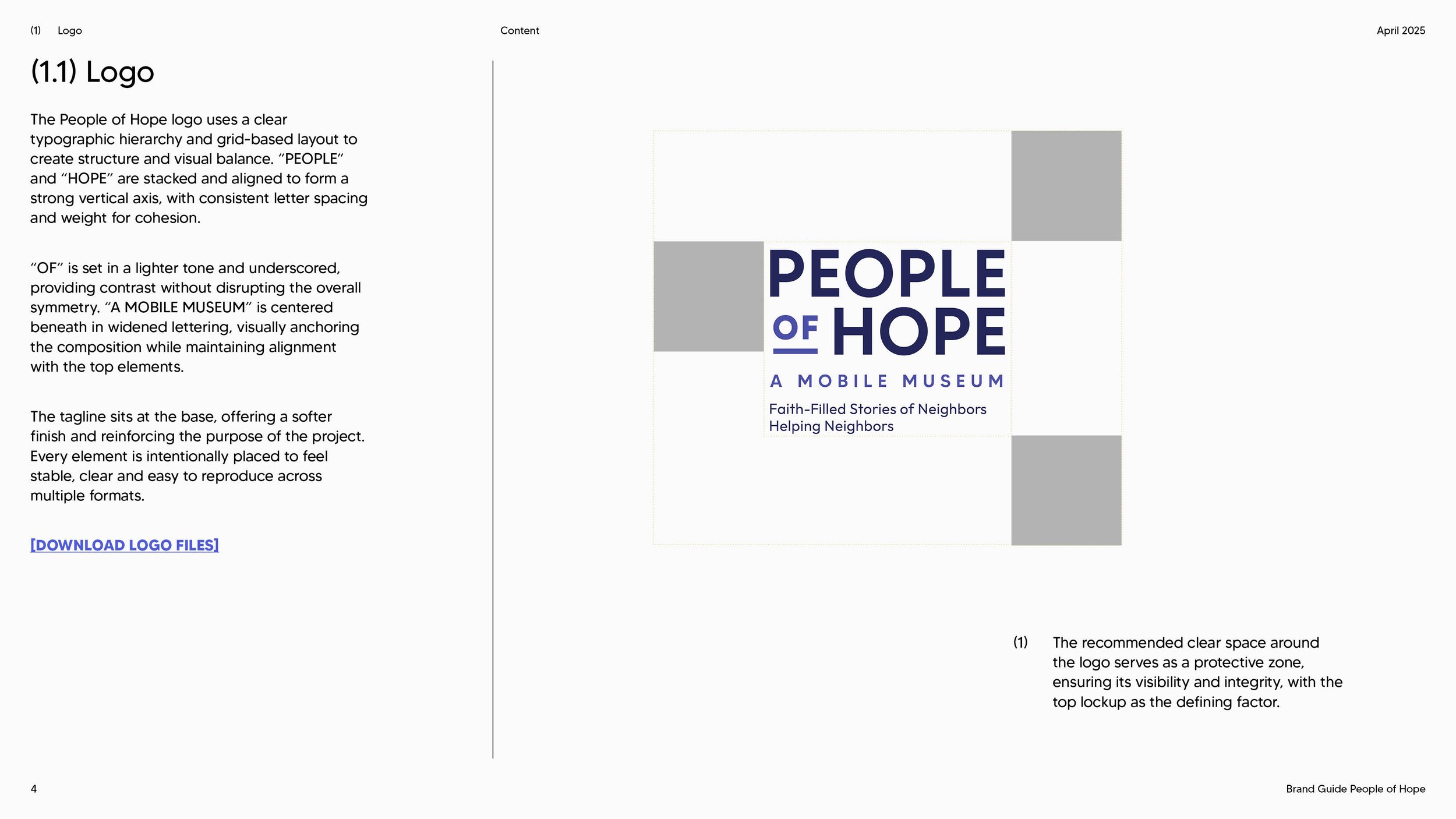
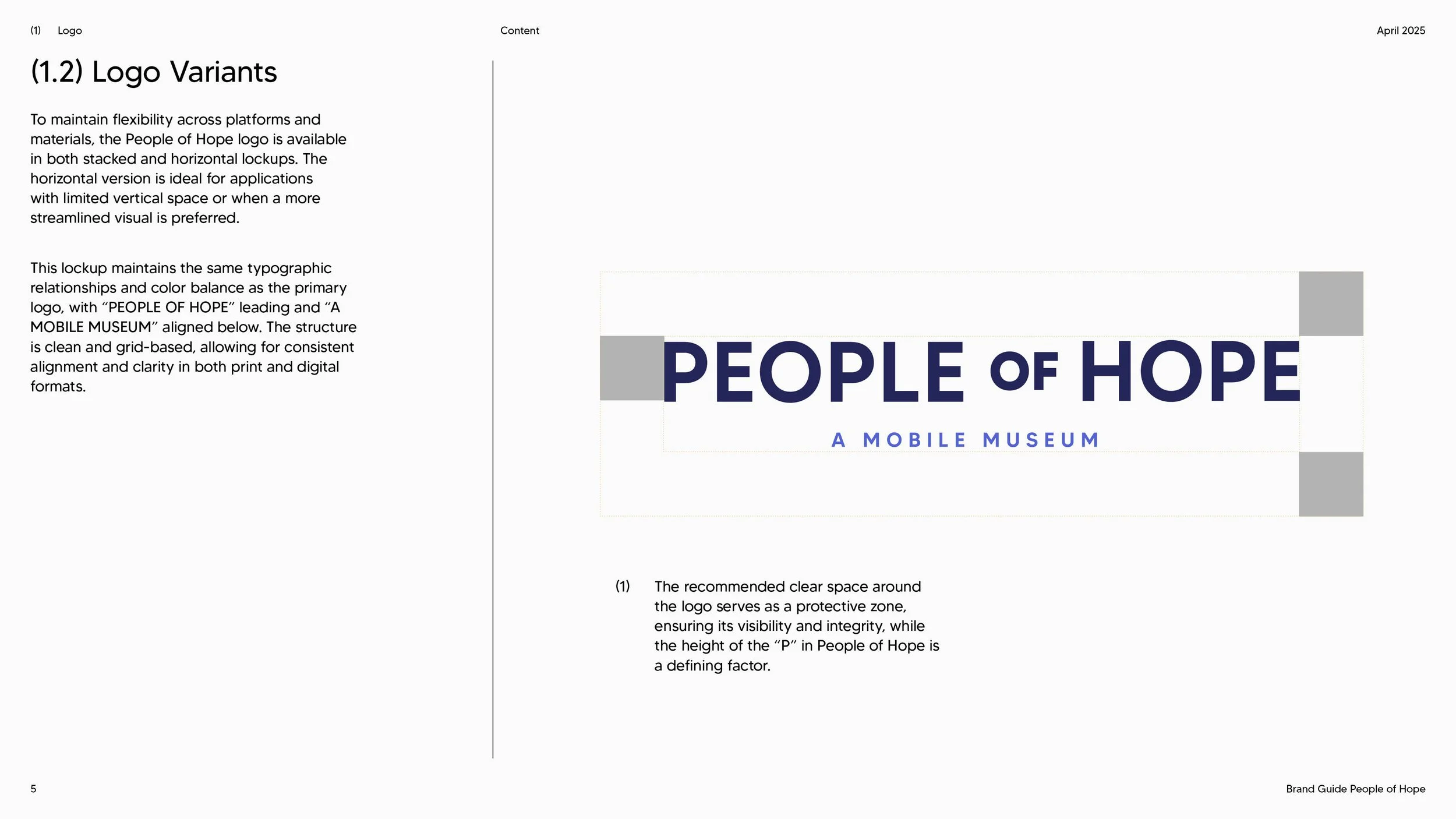
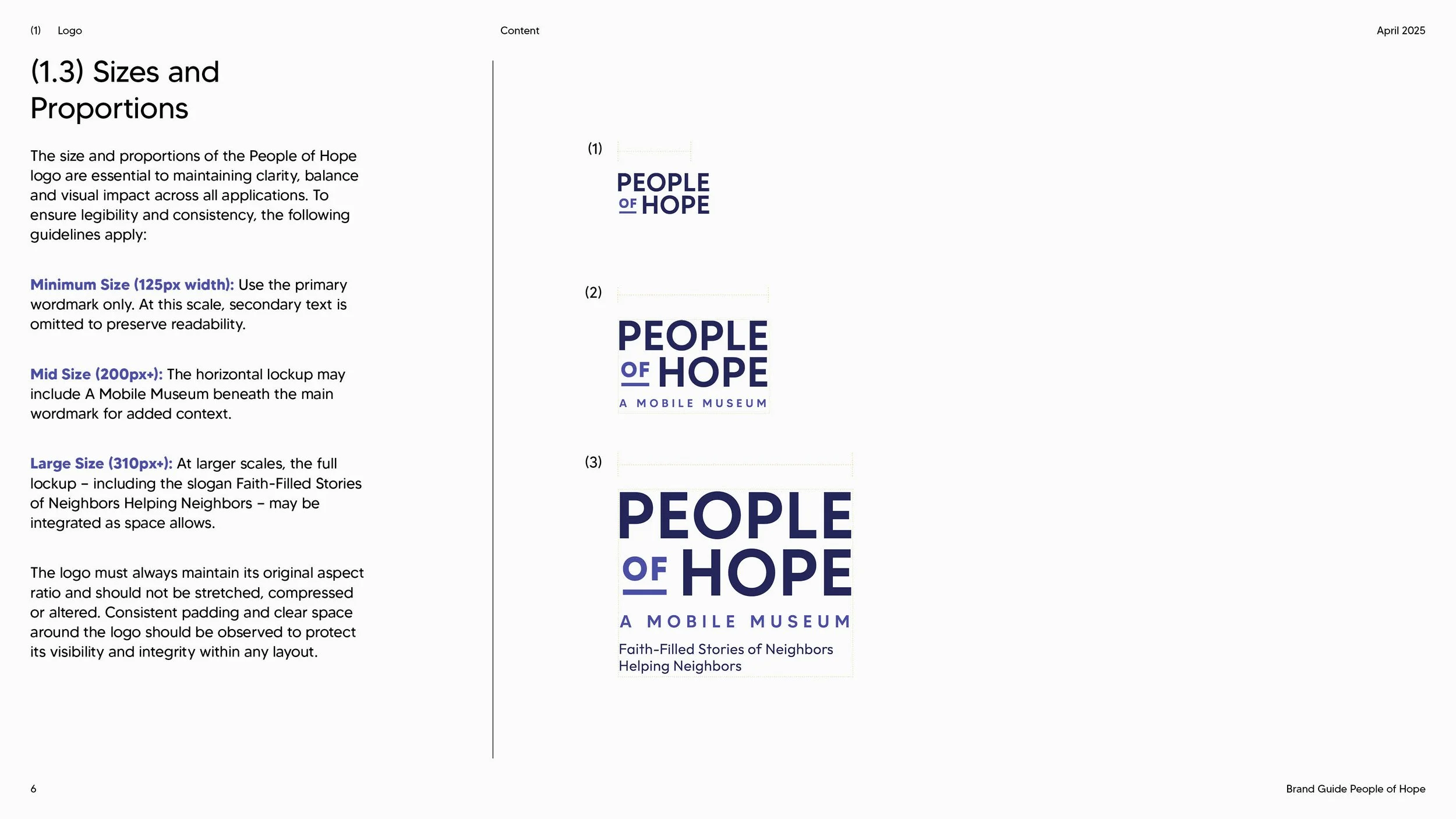
Faith-Filled Stories of Neighbors Helping Neighbors
Designed as an immersive, traveling experience, the museum invites visitors to step into another person’s shoes, explore the scope of need within their own communities, share personal stories of hope, and leave inspired to serve.
Learn more and find an upcoming location: peopleofhope.us
Video developed by Ryan Blaske of Blaske Studio.