Jeremiah’s Pick Coffee: Brand Logo & Packaging
san francisco | MAY 2020
The team at Jeremiah’s Pick Coffee came to me with a goal to update their packaging while remaining true to themselves and recognizable as a company. Jeremiah’s Pick has been around for over 25 years in the San Francisco area, to lose their current demographic could prove troublesome to their brand. We focused specifically on the older market already captivated by this delicious brand and modernized the brand’s previous look and feel to increase their target market to a younger audience.


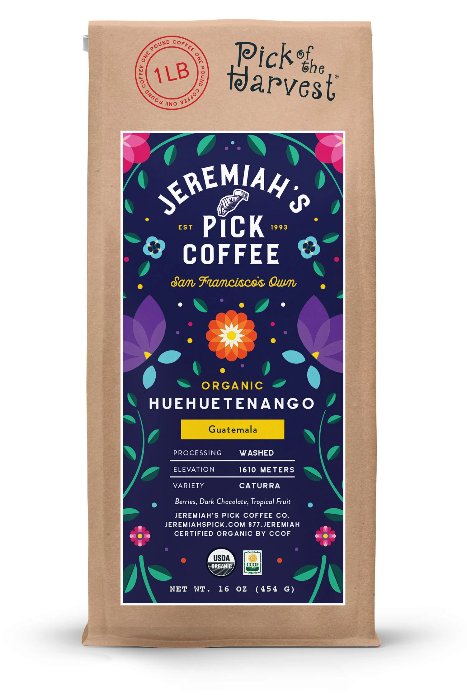
PICK OF THE HARVEST LABELS
Each region’s culture and textiles inspired the label designs for Pick of the Harvest.
From JPC’s website, I found two statements that set the tone for my work, “We believe in finding the best beans from around the world to make coffee that tastes incredible,” and “By establishing long-term relationships for the supply of quality green beans that support investments in land and people, we ensure quality, consistency and integrity.”
People matter. Quality matters. An investment in the region matters. This is where a deeper cultural understanding emerged and the focus behind textiles passed down from generation to generation influenced design.


HOW WE MODERNIZED THE overall LOOK OF JPC
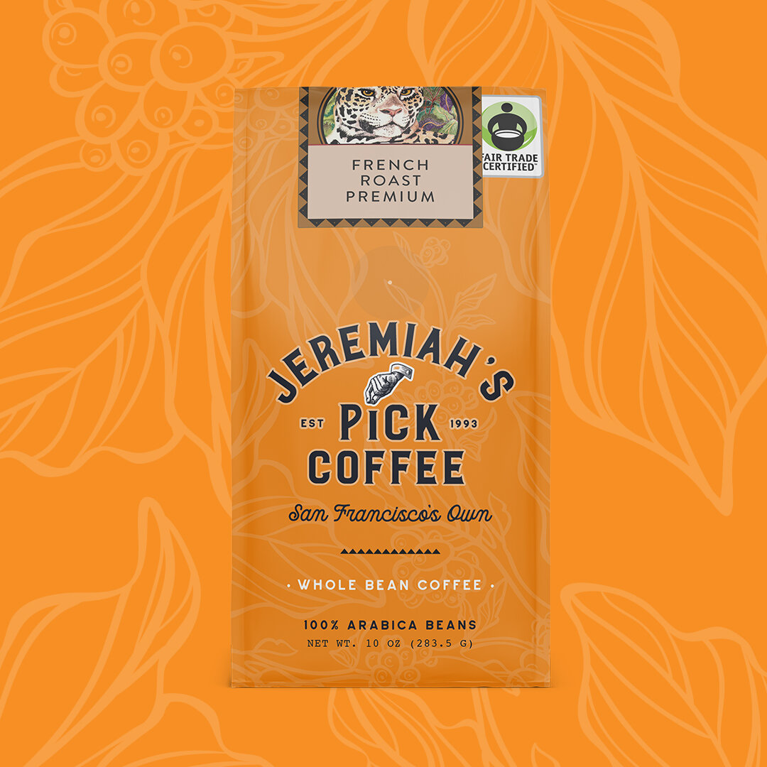
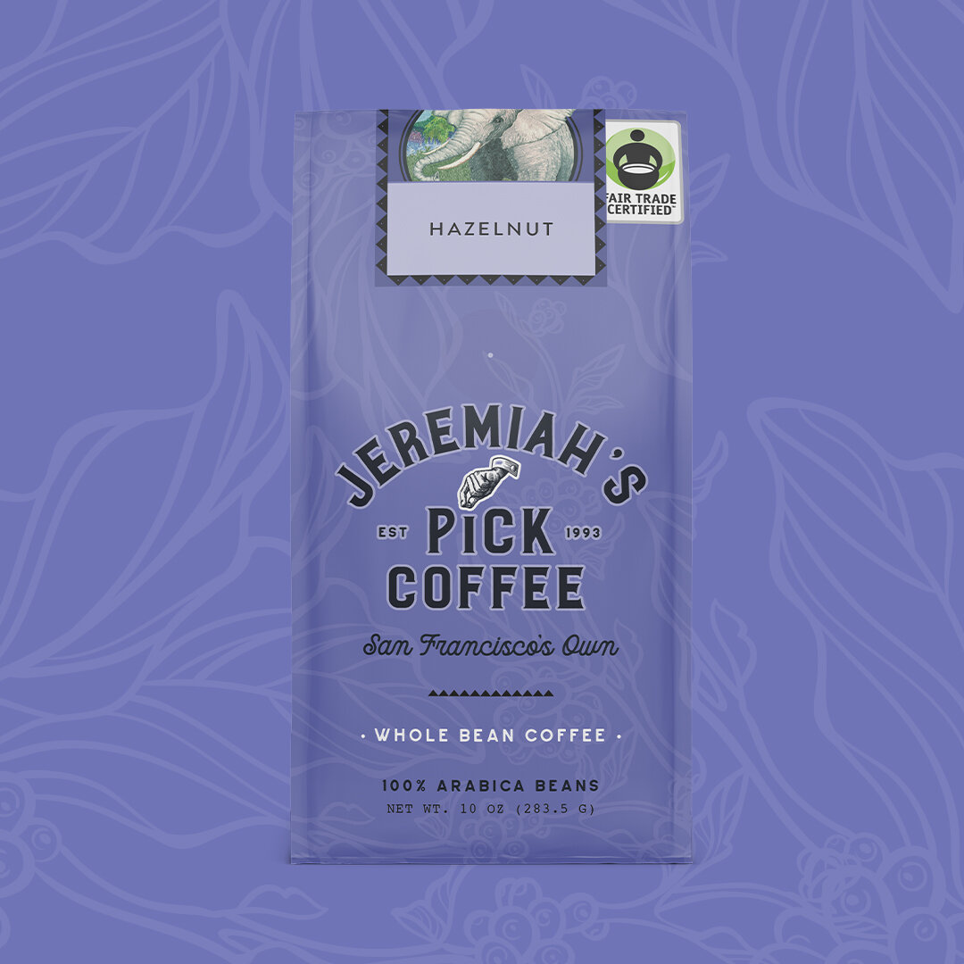
Without a complete redesign, we were able to refresh the logo by removing a dated medallion wrap and fonts. The word “Pick” was made actionable by eliminating the rest of the previous illustration. The new monotone color allows for the logo to work more seamlessly throughout a variety of color schemes. We created consistency throughout the bags in regards to logo placement, color, and texture.
We wanted the packaging to jump off of the shelves at the local grocers so we matched the hues to their most vibrant organic blue. The previous coffee leaf texture remains to maintain a recognizable package design. The original, tropical-style, bag enclosures which coexist as labels remain and only add to the vibrancy of the new package design.
View Previous Designs: